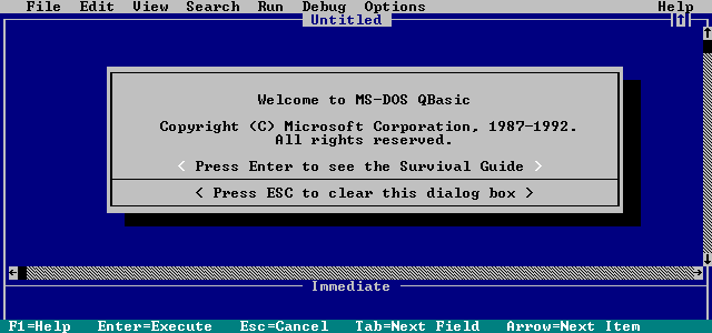
I’ve been writing code for a while. I started with QBasic when I was a kid and the two things I remember from that time was using PRINT and the fact I was dead confused by the editor I had to use.
I might also have written something calculating my age based on my birthday…
Computer science!
The Internet
A few years later, I’m around 12 years old and the internet is a brand new thing. I use my AOL browser and my 56k modem to browse the web and it’s amazing.
Seeing all these websites makes me want to create my own. Something great. Something about pokemons, AOL chatroom bots or whatever I was interested in at the time !
The thing is that back then there was very little information available… or at least I didn’t know where to find it. After time spent on forums whinning for help, I only found that I had to download SiteAid.
For reference, here is what it looked like in all its glory:

Since I wanted a menu on the left and content on the right, I somehow understood that I could use frames to do that. After some fiddling around with the UI, I got it to work.
The problem is that I stopped trying to figure out things here and started building my website.
Tutorial (aka The Abomination)
So first you want to create your main page:
<HTML>
<HEAD>
<TITLE>INTERNET!</TITLE>
</HEAD>
<FRAMESET cols="20%, 80%">
  <FRAME src="f1.html">
  <FRAME src="f2.html">
</FRAMESET>
</HTML>
Let’s add some sweet design in each frame file:
<BODY bgcolor="orange">Content!</BODY>Right away it starts looking good:
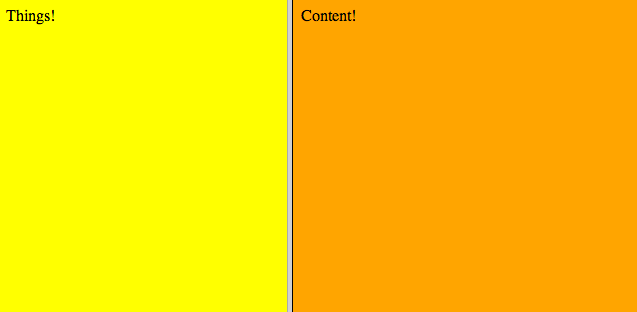
That’s nice, but I want to have more than 1 element in my left menu, so how can I do that ? You could very much do this:
<BODY bgcolor="orange">Menu 1<BR><BR><BR>Menu 2<BR><BR><BR>Menu 3</BODY>The problem is that then you won’t have colors on your menu items ! That’s when my very clever trick comes in. You just need… more frames !
Change f1.html to look like this:
<HTML>
<HEAD>
<TITLE>INTERNET!</TITLE>
</HEAD>
<FRAMESET rows="25%, 25%, 25%, 25%">
  <FRAME src="menu1.html">
  <FRAME src="menu2.html">
  <FRAME src="menu3.html">
  <FRAME src="menu4.html">
</FRAMESET>
</HTML>
Wow. Such color. Much design.

You can even create some impressive gradients with only a few more lines of code and knowledge of advanced colors in HTML.
<BODY bgcolor="black" text="white">Menu 1</BODY>
Finally let’s say I want to add an image next to a menu item. Seems complicated, right?
No. It’s easy when you use frames!
You only need to change menu.html like this:
<HTML>
<HEAD>
<TITLE>INTERNET!</TITLE>
</HEAD>
<FRAMESET cols="20%, 80%">
  <FRAME src="new.gif">
  <FRAME src="menu1_text.html">
</FRAMESET>
</HTML>
Perfect.
Now for the protip. If you want your website to look perfect, you want to hide the construction lines that are the frame borders. To do this, add a frameborder set to 0.
<HTML>
<HEAD>
<TITLE>INTERNET!</TITLE>
</HEAD>
<FRAMESET cols="20%, 80%" frameborder="0">
  <FRAME src="f1.html">
  <FRAME src="f2.html">
</FRAMESET>
</HTML>
Now you have a professional looking website.
You’re welcome.

The Worst Code
My take on this is that the code you wrote yesterday will always be crap compared to what you can write today. Don’t be depressed about it, that’s a good thing ! It means you’re getting better!
On some forum a few years back, someone asked “what’s the worst code you ever saw ?”. Someone responded something along the line of “every single piece of code I’ve written a long enough time ago”. I really liked this answer, quite humbling and much better than bashing a coworker or a random funny story.
So keep improving your skills, don’t feel too bad about past coding mistakes and don’t hate on new developers still learning - you were making the same mistakes at some point !
Since you scrolled this far, you might be interested in some other things I wrote:
- Building A Multiplayer 8 Bits Sequencer
- Generate Sounds Programmatically With Javascript
- Trailing Slashes, Github Pages, Jekyll 3 & 404s
- How CSS Animations Can Break Your Tests
- Some Respect For Legacy Code
- Enough With The Trolls
- Please Keep a Changelog For Your Open Source Lib
- Startup & Tech Book Reviews