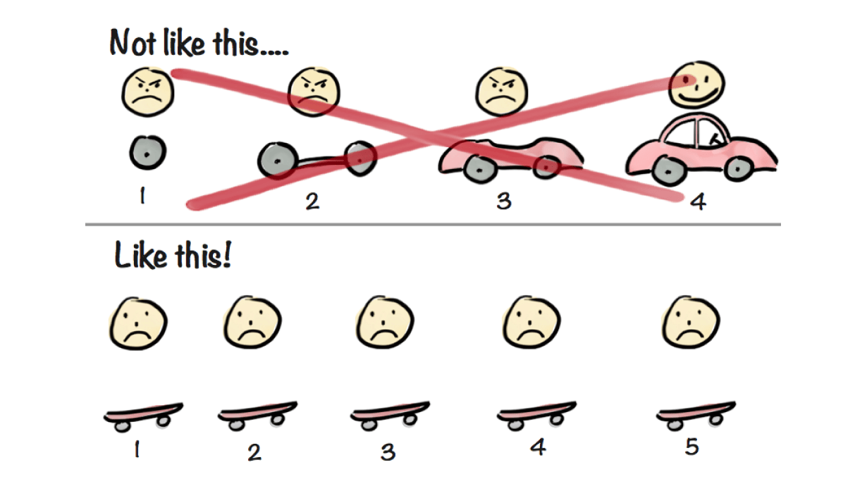
When building software, there are many cases where it’s more efficient to start with a minimum viable product (MVP). This is also true for a feature: before building the fully-fledged experience, it’s best to get something out the door and in front of users. You get to learn faster from customers and don’t waste time building useless stuff.
Interestingly, it sometimes happens that this minimum viable feature stays in production without iterations for a long time, regardless of how it performs in front of users. There are many reasons for it. Maybe it’s more exciting to start working on the next thing or maybe, by the time teams are finished gathering insights about the feature, people already have forgotten about it and moved on. I don’t really know.
Regardless of the reasons, do this enough times and you end up with a half baked product made of many “minimum viable features”. The whole thing kind of does what it should do, but really lacks polish and soul.
This of course happens to me as well. Today I’ll talk about the time I left a feature like this in my mobile app for almost 2 years before realising that people were actively using it and it really needed some love.
The Combo Creator Feature
Some context
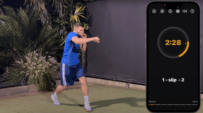
My app is a tool to practice boxing from anywhere. Basically, you start a workout and the app calls out actions to perform. The whole thing is based on a system where a number is associated with a kind of punch, for instance “1” is a “jab”, “3” is a “lead hook” and so on.
You don’t need to understand the app to understand the rest of the article, but to see what the app looks like in action you can watch this video.

The MVP
The app provides many pre-made exercises and complete workouts which are a combination of various exercises. From what I saw from users, that approach fits what most people want. However, if you really know what you are doing, you probably want to create your own exercises. For instance if you are trying to improve a very specific combination of punches or if you want to focus on a given defensive movement.
I actually received feedback from some users that they would like some kind of advanced customization like this, but I wasn’t sure how it should work, or even if people really wanted it… the perfect situation to build an MVP of that feature!
To be viable, the feature would need to allow users to create an exercise, attach a bunch of actions to it, and finally be able to add the result to a complete workout. With this in mind I got started and built this:

At that point you could add your custom combos. However to move faster I had to take a lot of shortcuts:
- I exposed how to combo manager worked internally with a lot of weird codes (“pv” for “pivot” for instance). To fix this, I added an awkward help sheet with basic explanations.
- The UI was not consistent with the rest of the app. For instance buttons are not aligned, I’m using those weird white on black “pills” to display code that are nowhere to be seen in the rest of the app. The list is also
insetfor no reason when the rest of the app isplain. - The whole thing doesn’t match usual UI patterns you’d find in the ecosystem. For instance the trashcan icon next to a text field to clear its content is not common.
- There is no validation and people can create nonsensical combos. For instance you could “dodge left and right”. While some very talented boxers might be able to break time and space and dodge in two directions at once, my guess is that it’s probably a good idea to not allow that.
The good news is that, despite its imperfections, it did what I wanted it to do and I shipped it in less than a day. After a couple of weeks I learned through tracking that people were actively using it. Not that many people mind you, but a decent amount and they would use it a lot.
However it wasn’t game changing, since maybe only 5% of users would give it a try, so it wasn’t the most important thing to improve at the time. It wasn’t a failure either, so it didn’t make sense to just remove the whole thing… so it ended up in this MVP state and I kind of forgot about it for two years.
The new version
Fixing issues
A couple of months ago, I worked with an influencer on a partnership. While doing this, he praised the custom combo feature. I found that surprising since, to me, it was just this edge case feature that I had almost forgotten about. However to him it was clear that it was really helpful for experienced boxers like him.
I looked back at the feature and cringed at the shortcuts I took. I decided to spend a bit of energy to improve it and I:
- Stopped exposing internals and instead use what users already knew (1-6 for punches + full names for defensive movements). This allowed me to entirely remove the awkward help sheet.
- Changed the trashcan icon to the side of the input to the more widely known pattern of the “X” inside the input.
- Made it so you couldn’t create nonsensical combos, with some elements being deactivated contextually. For instance you can only add “to the body” after a punch, as “pivot to the body” is probably something you don’t want to do.
- Adjusted the UI so that everything was properly aligned. On this one I was able to leverage LazyVGrid , which I couldn’t do back then since I was supporting iOS 13 and this is an iOS 14+ feature of SwiftUI.

New tests
This was better and addressed some issues. However there were still some things I wanted to try that I didn’t validate yet… so I added a few more ideas in an “MVP state” to know if users would be interested and if they would fit the experience:
- Added a way to hide the “keyboard” to see more of the screen (icon on the top right). It lacks a tutorial, the icon is not the most obvious, there isn’t an animation when hiding the keyboard… but I’ll see if people click on it and when.
- Added another defensive movement, “lean back”. At that point it’s not perfectly integrated to the rest of the app, but it works and I’ll see if people use it in their combos.
The Risks of not Iterating
If you end up mostly building many minimum viable features and not iterate, you will most likely encounter one of two problems.
The more obvious one is that you’ll miss out on potential gains from the learnings acquired when building the MVP.
The second one is sneakier. In larger organisations, you will implicitly encourage people in your company to build larger and larger features, stepping away from the shipping small and iterate mindset.
This is not intended, but not iterating means that if a stakeholder wants a “complete” feature shipped, not just a minimum viable one, they will need to push for the full thing to be completed. This is because they let an MVP be completed, their long term idea might be dismissed and they’ll be told “we already have an MVP, we can’t prioritize this right now”. This will slowly lead teams to create larger and larger projects without showing them to customers.
Overall, most teams start with the intent of building an MVP and then improve it. However, often for good reasons at first, I’ve seen many situation where it’s decided to discard the “iterate” part in favor of building the next thing… and then no one goes back to improve the initial feature.
Final Thoughts
For my particular use case I think I was right to start with this half baked version. It did prove that there was a need and that I could address it. However, if I could go back in time, I wouldn’t wait that long to iterate and make the whole experience better.
Now the new version is also far from perfect. The UI, while more usable, is still pretty crowded and takes a lot of the screen with not enough white space. It’s also not fully extendable so that I can add many more movements. There are still visual inconsistencies, the button to add a new combo looks terrible and many other problems I’ll need to address.
I think it’s all fine. This version is still much better than the previous one… and now I will make sure to improve this feature consistently based on user feedback and data instead of ignoring it!
Since you scrolled this far, you might be interested in some other things I wrote:
- My Experience with Liquid Glass so Far
- Building an App to Find Highway Stops
- Sometimes Details Are Everything
- LLMO: SEO in the Age of AI?
- Asking for user feedback
- Breaking the Routine with a Quick App
- Remove That Feature
- Minimum Viable Content
- Building, Releasing and Marketing an iOS Fitness App
- Startup & Tech Book Reviews
