After more than 3 years mostly untouched, I recently revamped the main screen of my fitness app — the one that calls out boxing actions during workouts.
The Redesign
One piece of very valid feedback I received was that pausing was inconvenient. Initially there were only 3 buttons up top so the pause was fairly easy to find, but as the app grew, I just kept adding buttons there until it became a cluttered mess of small icons.
Taking this into consideration, I redesigned it and here’s the result:
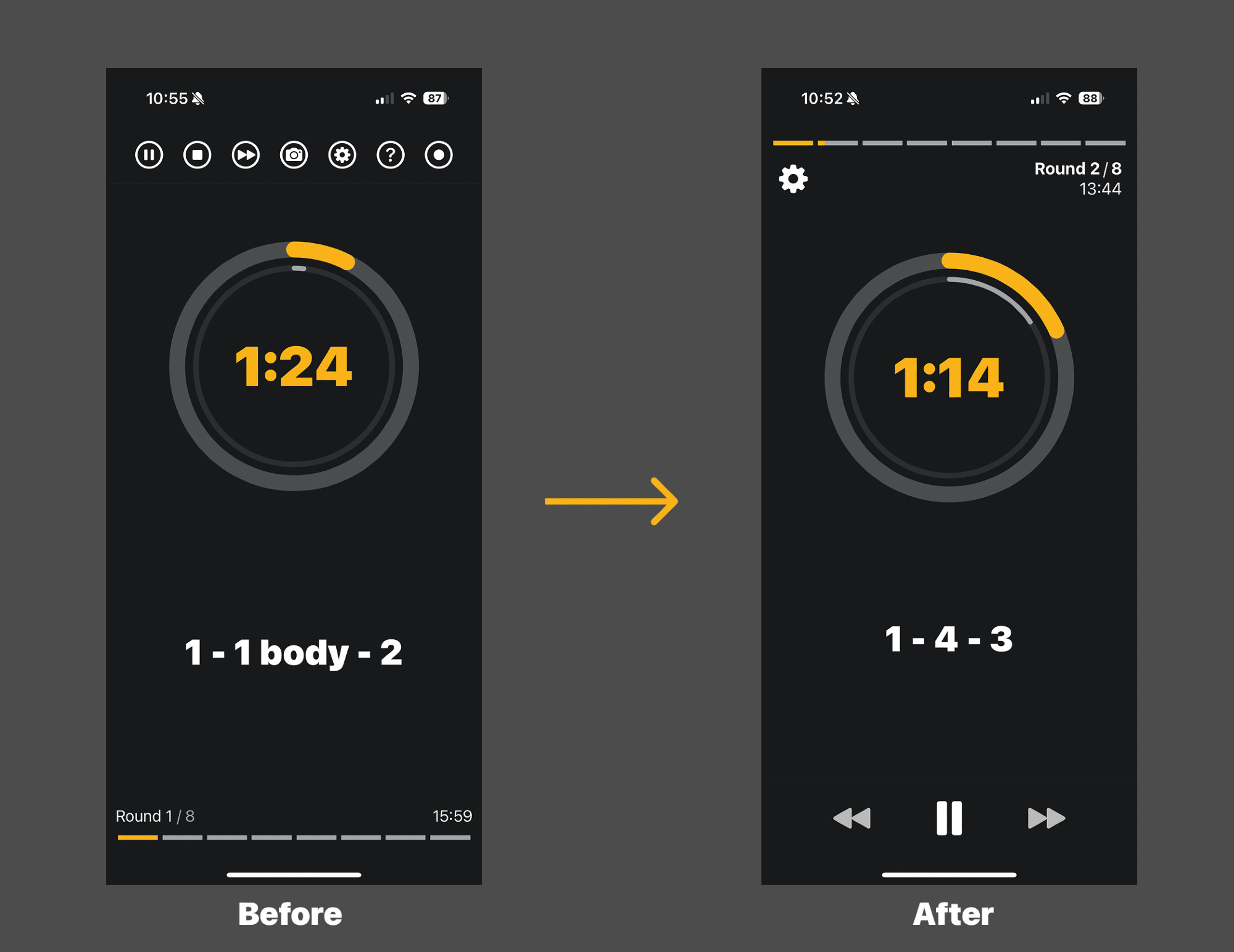
It felt much better, and after asking users for feedback, it seemed like I had a winner.
The “pause” action is clearly more efficient than before. Instead of a small icon up top, we now have a big one, very accessible at the bottom of the screen. Looking great so far!
The Problem
The new UI felt good, and both my users and I were happy about the improvement. However when I was looking at actual boxers using the app, the behaviour was always the same when trying to pause for the first time. They would:
- Tap the screen in a random spot
- Notice that nothing happened after a couple of seconds
- Tap the pause button
Of course I knew about this tradeoff when working on the design. Video apps all have a feature to pause when tapping the video, and many fitness apps do the same. I skipped adding it because it was seemingly such a small detail I assumed it wouldn’t make a difference, and the cost to add and maintain it wasn’t trivial.
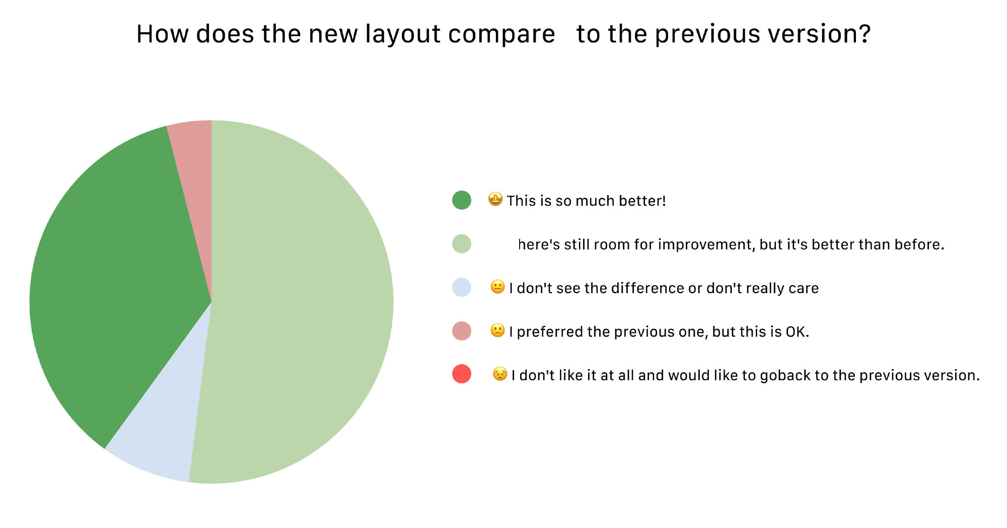
Still, since I was curious, I decided to add some tracking to see how many people behaved like this. Turned out that more than 70% of new users were doing this, meaning tapping the screen first to pause.
They would eventually learn and all power users were using the actual “pause” button… regardless, the data was clear: the UX was not good enough and I vastly underestimated the impact of not adding this feature.
Details Can Be Everything
As a solo developer, I need to make hard tradeoffs all the time… however in this case details were everything. When you are sweating during a workout and someone interrupts you suddenly, you don’t want to struggle to pause, especially with boxing gloves on! It should be exactly the way you expect it to be, no friction.
Obviously hindsight is 20/20. It wasn’t a detail, it was a big expectation from users, and of course I implemented a fix.
Still, it was surprisingly easy to dismiss such a crucial element! Paying attention to my users, asking for feedback and following data is what saved me here… and of course having the ability to allocate time to improve the feature.
Since you scrolled this far, you might be interested in some other things I wrote:
- My Experience with Liquid Glass so Far
- Building an App to Find Highway Stops
- LLMO: SEO in the Age of AI?
- Asking for user feedback
- Breaking the Routine with a Quick App
- Remove That Feature
- Minimum Viable Content
- Don't Forget to Improve your MVP
- Building, Releasing and Marketing an iOS Fitness App
- Startup & Tech Book Reviews