As someone making a living building iOS apps, I was anxious about the possibility of a large redesign in 2025… and I was right! The iOS 26 update is a massive one and will require a lot of work to get right.
Here’s my experience so far updating my apps to iOS 26 and using liquid glass. It’s not meant to be a migration guide nor an expert opinion, just a piece of feedback regarding what I went through.
tl;dr:
- I like Liquid Glass so far, it’s an interesting and refreshing proposition making native apps more unique.
- Like it or not, it’s there and app developers can’t ignore it.
- The migration experience varies a lot depending on the app. The more custom UI you have, the more painful it’ll be.
- There are still many bugs and significant performance issues in ios26-beta2.
Liquid Glass
I won’t get into in depth analysis of why Apple did this, the benefits of unifying the various systems, the relationship with VisionOS and so on… many people did it better than me, and I’m not a designer. So instead I’ll share my personal opinion!
Do I even like it?
At first glance, liquid glass looked pretty cool to me! It felt different but familiar, giving native mobile apps a more distinct look leveraging how they can interact with hardware. This is an interesting departure from apps and web looking more and more the same.
Like everyone, I had issues with the contrast and general readability… but I also remembered what people were saying when discovering iOS 7 for the first time, and how all those problems got addressed eventually. As a matter of fact, the beta-2 is already much better with contrasts, so I’m hopeful that most accessibility problems will be solved at the time of release.
 iOS 7 contrast
So far I’ve been using iOS 26 on a secondary device since it was available. I have to say that “old” apps look more and more outdated to me. To be honest, the old tab bar just feels clunky now.
I also enjoy the small animations and how buttons react to the touch. I don’t think that’s the most efficient, but it sure is delightful to interact with when it works well.
Of course I can recognise that some things are very gimmicky. For instance the full clear icon layout which is just unusable (I tried). In this case I even think this is more to show how far it can pushed and not a feature people will use.
Who is going to use this unironically?
So overall, I like the design proposed by Apple so far even! Of course, while I’m hopeful, I’m waiting for many problems to be fixed as I’m going to show later.
Does it matter?
Regardless of whether I like it or not, Liquid Glass is shipping with iOS 26 and I’ll have to deal with it. Firstly, I’ll have to make my apps work correctly, and then I’ll have to decide how much of the new design language I’ll bring into my apps.
The Current Problems (beta1 & beta2)
It’s a beta, I know, there’s going to be bugs… but wow, it is really buggy, even for basic features like buttons.
The crazy bugs
I’m seeing some ridiculous problems, like this one where glass buttons are just glitching like an old CRT TV when changing apps. I don’t think I’ve ever seen my phone behave like that.
There are also straight up crashes, but they felt more limited and I have yet to have a full crash on beta2.
The minor issues
Migrating to a “glass” UI is supposed to make everything look sharp and clean… but there are many small details that are just not polished up to the standard I would expect. It’s often nothing breaking, like a shadow suddenly disappearing instead of fading out, but small details add up.
I’m a bit worried about those ones, because they are easy to mark as unimportant… which is true in isolation, but when most components have a slight issue, the global experience suffers.
The performances
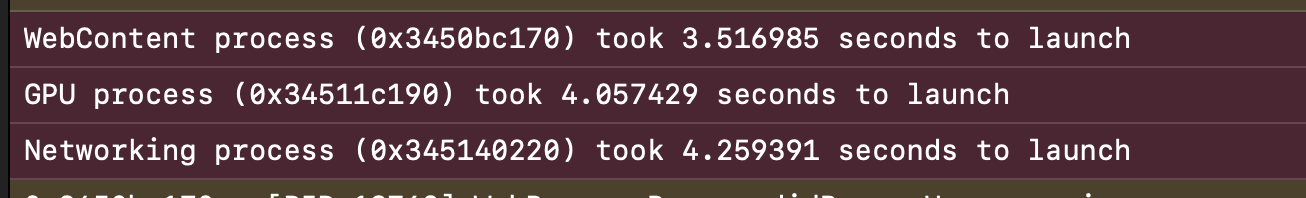
In terms of speed, the performances have been pretty bad on most apps. It was mediocre during beta-1, but it is abysmal on beta-2, and booting my apps went from a few milliseconds, to up to a minute. Same issues inside the apps, everything felt noticeably slower.
Note that I’m running iOS26 on an iPhone 12 mini, so I’m sure things are better on an 16 Pro. I also saw that performances in the simulator were also pretty bad, even if my computer is quite powerful.
The battery life seems also problematic, and I saw things as bad as 1% battery drop per minute when running my apps from XCode on a test device. I understand that it is somewhat of an old device, but this is ridiculous and I now have it always plugged.
To sum it up so far:
- iOS26-beta1 was fast but destroyed my battery
- iOS26-beta2 respects my battery a bit more, but it is so slow at time it’s barely usable (some apps take up to a minute to boot)
I hope that beta3 will solve this, as I don’t want to deep dive into performances when my apps were working just fine on iOS 18.
The tooling
So far I haven’t run into many issues with the tooling. Some defaults were changed, like how pin tabs are handled, so it caused a bit of confusion… but aside from that things are running just fine, so kudos for that!
Migrating my Apps
I have 3 apps that I’ll have to update:
- The Shadow Boxing App, my main project and a 5 year old codebase started in iOS 13.
- Pause Autoroute, a brand new project that is fairly small in scope and iOS18+ only
- Modern Interval Timer, a timer with a focus on customisation and using the latest iOS niceties.
Each one has its set of opportunities and challenges. Here I’ll focus on the first two, because the timer has very similar design choices to Pause Autoroute.
Methodology
In order to update to iOS 26, I gave myself 3 rules:
- In doubt, fallback to iOS defaults and let the system figure it out
- Use OS conditions sparingly, ideally only for a modifier here and there.
- Only build fully different components if there’s absolutely no other way.
To help me move forward quickly I used this function:
extension View {
    func apply<V: View>(@ViewBuilder _ block: (Self) -> V) -> V { block(self) }
}
… which helped me do things like this:
Button().apply {
    if #available(iOS 26, *) {
        $0.buttonStyle(.glassProminent)
    } else {
        $0.buttonStyle(.borderedProminent)
    }
}
The idea is to figure out exactly what kind of differences there’ll be between older OS and iOS26. Once I understand that better, I can then add modifiers embedding this logic like:
Button().prominent()
The Shadow Boxing App
Removing many custom things
This app is quite large and was started with iOS13, meaning when SwiftUI wasn’t that stable… so there are a lot of tricks, workarounds and overriding the defaults, which was necessary to get things to look good. Since then, most of my hacks were incorporated into the framework, but I didn’t always bother to clean up.
For instance many views had custom nav buttons because the default ones were just not looking good. I would add some additional padding or some kind of background to make them more usable. Now, not only it is not required anymore, but leaving the custom controls looked bad, so I had to update everything.
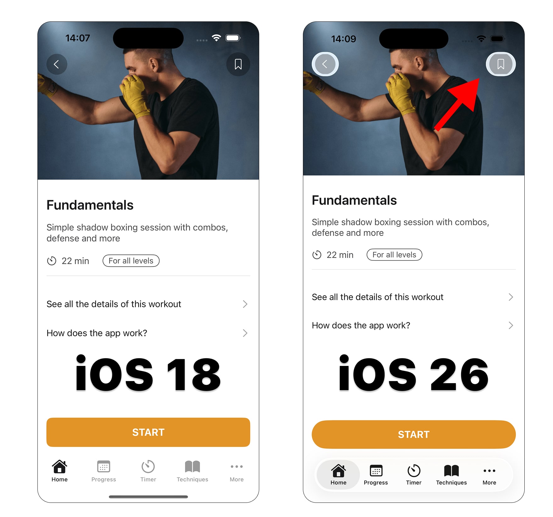
I also had tweaks to the UINavigationBarAppearanc that were required for iOS 15, but looked terrible on iOS 26. I ended up removing many of those, leaving a mostly vanilla navigation bar.
Mistakes were made
While building the app, I was discovering SwiftUI that just recently came out. Because of this, I made some choices mistakes and now I had to pay this debt. For instance, I split how a button looked from how it behaved, making it look like this:
Button(action: {
  // Some action there
}) {
  Start(message: "Hello World") // A custom view with how the button looks
}
This worked perfectly fine, and allowed some freedom to solve specific problems at times… but this just didn’t allow to migrate to glass buttons, so I had to refactor my code to:
Start(message: "Hello World", action: {  // Start now embeds a button
  // Some action there
})
This seems small, but I had that nonsense all over my app.
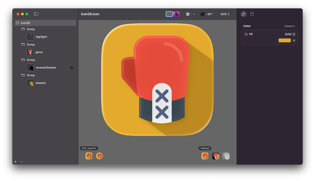
Icon Composer
I was worried about my icon, because it very flat by design with a shadow cast on the background. However, rebuilding it with Icon Composer to get the full “power” of liquid glass was surprisingly simple and fun. I had to retrace some elements to have cleaner source files, but overall the experience was pleasant and I like the new icon more than the old one.
On the Design Front
Some past choices are incompatible
There are cases where my design doesn’t really work anymore with iOS 26.
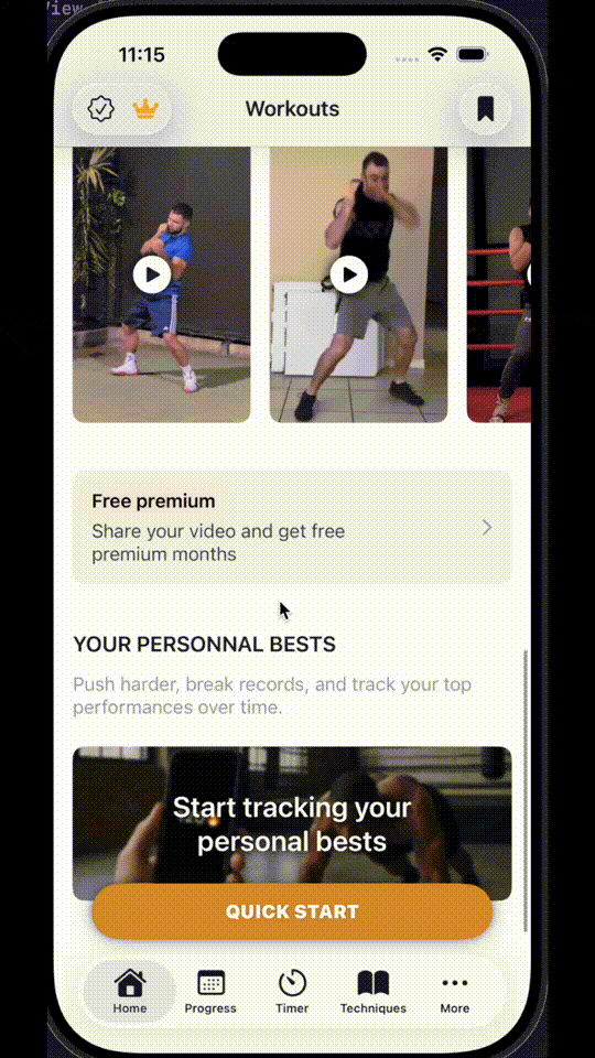
For instance I have this floating “quick start” button. It’s ok when the tab bar takes the entire width of the screen. Now, with the new floating tab bar, it just looks like I’m stacking a bunch of controls at the bottom of the screen and you lose the split between navigation and actions I had before.
Some are completely glass-ready
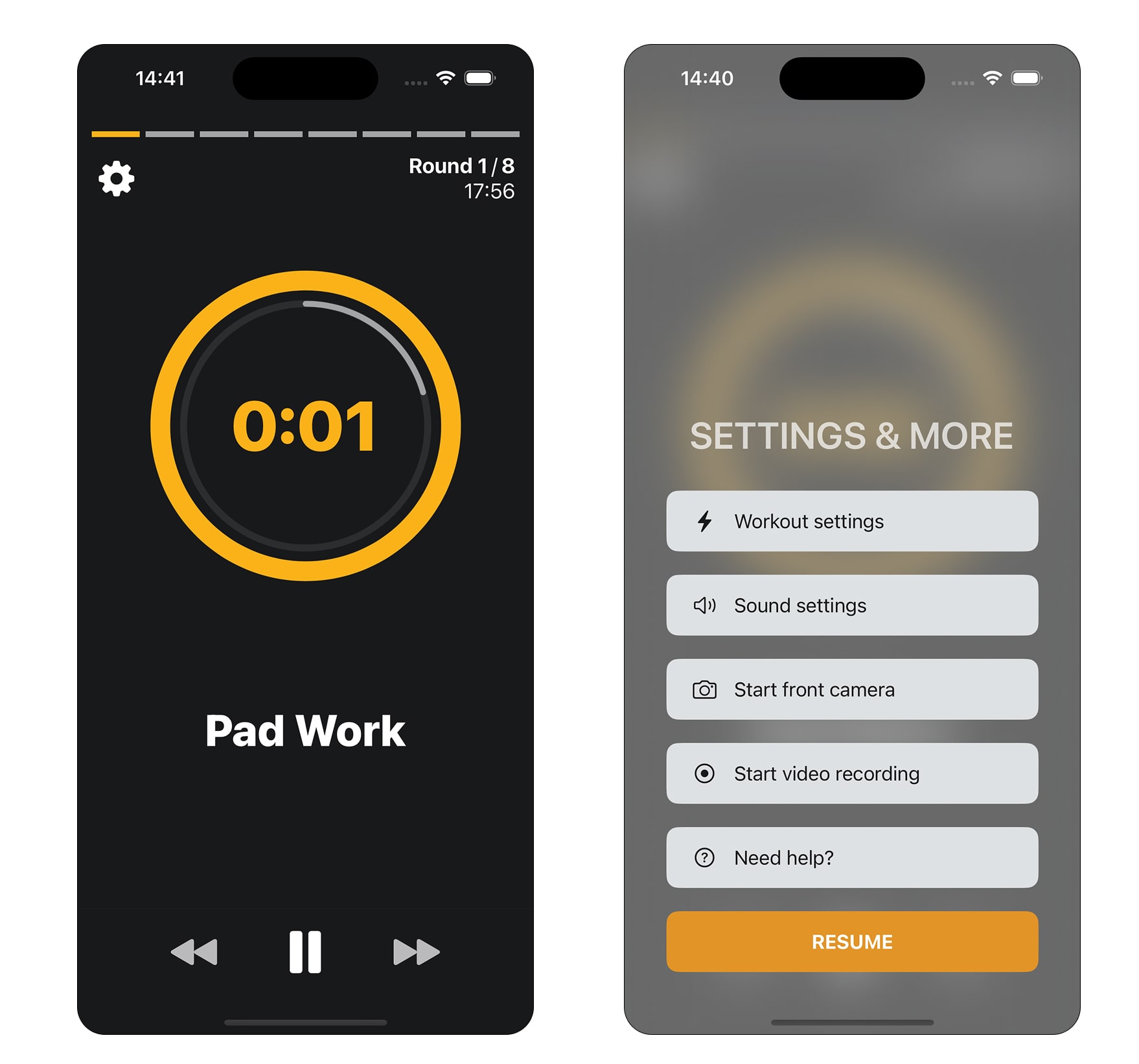
When I dropped iOS 15 support, I decided to use materials much more, which turned out to be a good idea as it looks right at home alongside liquid glass components.
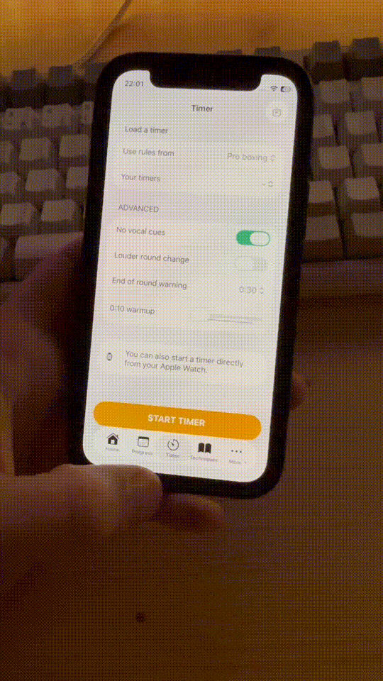
For instance here’s the workout settings menu that is overlaying on top of the timer and is already looking pretty nice:
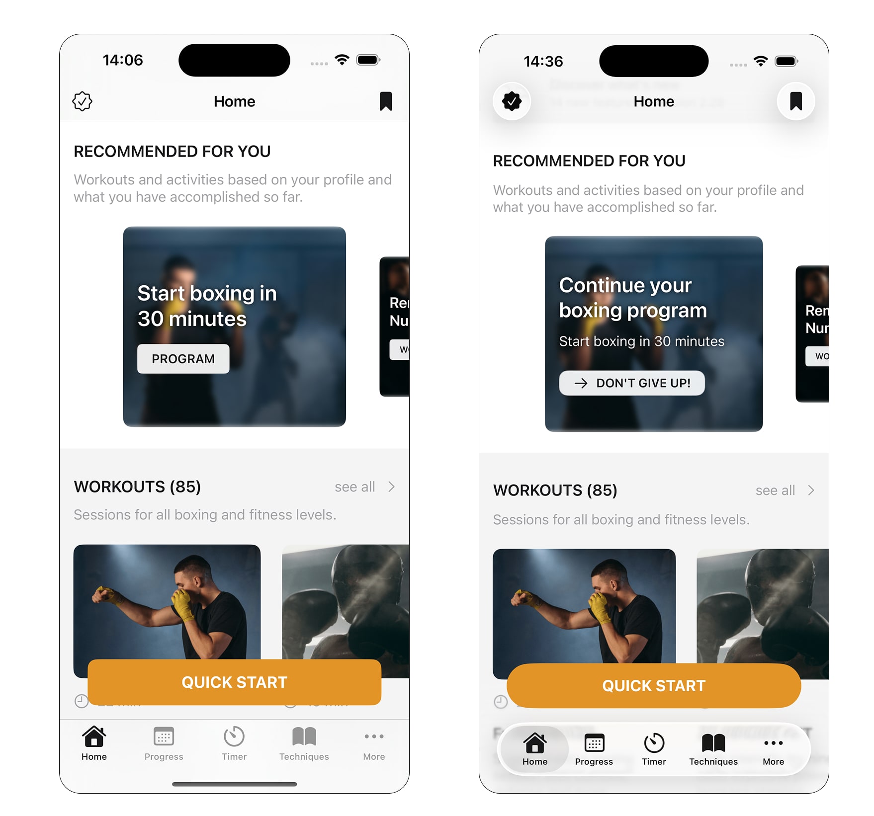
Moving forward
For future updates, I’m now trying to have designs that feel more in line with iOS 26, even for earlier versions by leveraging materials and some very light opacity tricks.
Looking at the screenshot below, I transitioned from a solid navbar + solid filters backgrounds to everything more floaty and using materials. I personally think it looks better and utilises more of the screen.
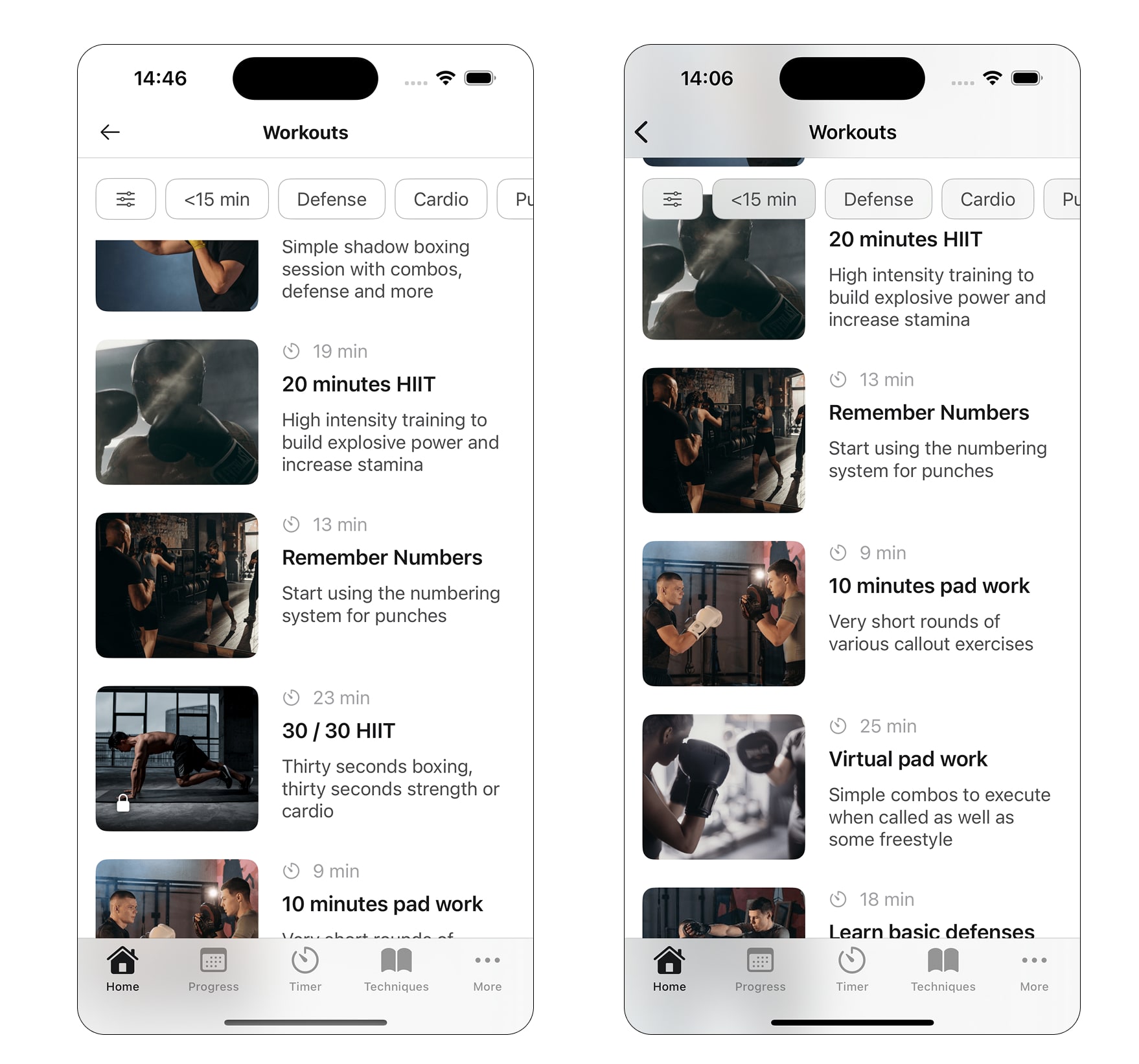
Blinking UIs
I’m using a lot of photos in this app, and part of the idea is to play on this contrast between the boxing photos that are darker and the UI that is mostly white. I’m not sure if that’s the best design, but it’s what I went for!
The problem is that it just doesn’t work well with liquid glass. The tab bar and nav bar need to have a consistent color “mode” to behave properly and not switch between light and dark constantly. Right now, scrolling through my app makes both blink, especially the nav bar, and it doesn’t look good at all.
This is not really visible in main Apple apps because either they keep a similar color through the view (mostly dark or mostly light), or they “cheat” by preventing the elements to change. Here’s how it currently looks in the Apple Fitness app:
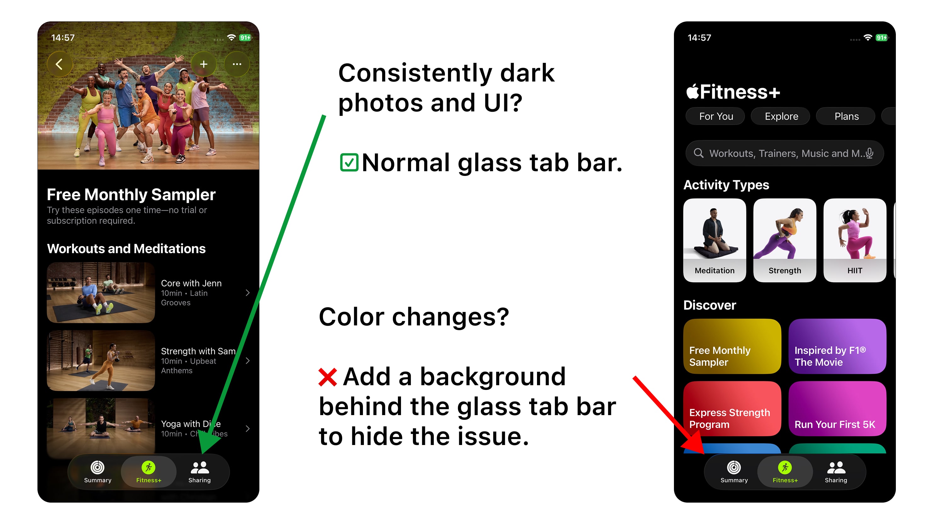
This one is quite worrisome to me, because it is not a bug per se, and Apple could very much say that apps should be either dark or light, and avoid what I’ve built so far. This would require me to either:
- Move everything to a darker design, which is fine but also a lot of work
- Fake it with solid backgrounds below glassy elements, which is just sad
Pause Autoroute
This app is way smaller and more recent, so migrating it to iOS26 was actually really fun and allowed me to really embrace the new design. Here’s some examples of what I changed for the main screens.
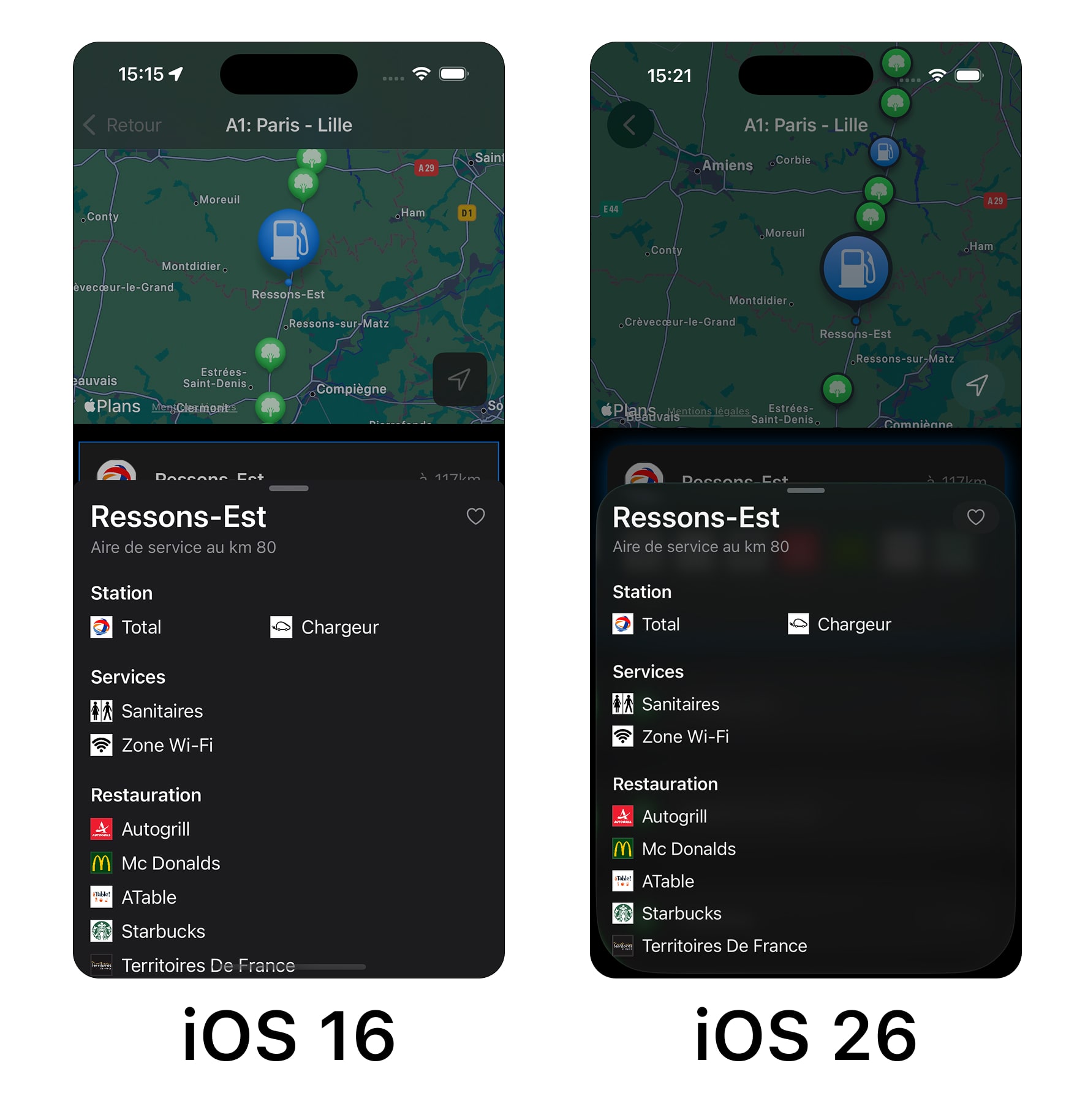
Stops
On the view displaying highway stops, I use glass buttons when relevant. It feels especially nice on the location button above the map, both when tapping it or moving the map around. I also made everything rounder, and decided to use a light glow to show selection instead of a border.
One surprising thing is how flatter the map markers are now, with a big black outline. It felt like this should have been the other way around.
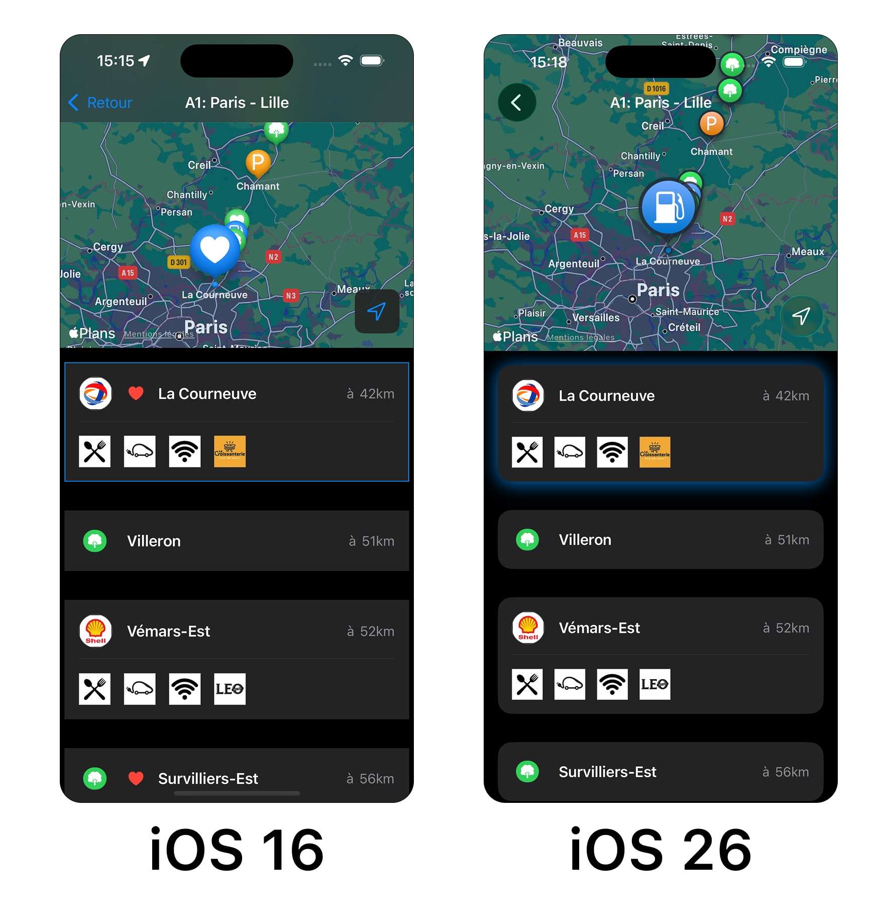
Right now I haven’t figured out how to improve the nav bar that is not properly adding a blur, making it hard to read. It might also be a bug.
Stop bottom sheet
I really think that the new bottom sheet looks better in this layout, especially in dark mode where the contrast is actually better! It doesn’t show on the screenshot, but the glass “favorite” button with the small heart feels really good to tap.
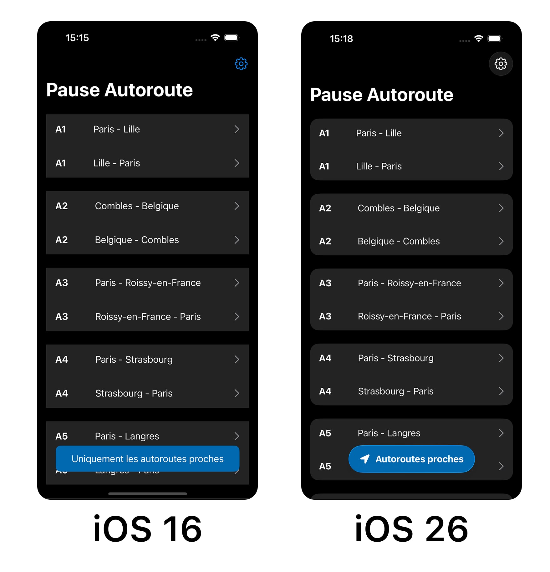
Highways
Nothing crazy on the highway list, I made everything rounder, which also pushed me to make the main CTA shorter.
General feel
I think the iOS 26 version now just feels better than the iOS 18 one. It’s hard to pinpoint why, and it’s even harder to showcase it via screenshots. There are tons of small interactions that are just more pleasant, like how touching a button makes it shine a bit:
Conclusion
My takeaway
So… how do I feel after a few weeks with iOS 26? I’d say that it’s not as bad as I expected!
There are still a few things that are worrisome. The main one is the performance / battery issue. If it’s not fixed by the OS, it will require really complex work on my end to fix performance issues that were not present prior to the update.
However I’m still quite excited about using the new design. I’m not convinced that it will bring significant value to end users, but it will renew the UI experience and, as I’m confident that I’ll be able to migrate fast, it could also be a differentiator with others apps that will struggle to migrate due to inertia, technology choices or other reasons.
What should you do today?
We’re in July, so there’s still a couple of months before the release. Still, I think everyone maintaining apps should:
- Start using iOS 26 to get used to it. I’d recommend NOT putting it on your primary device though.
- Start removing components that are too custom, especially buttons.
- Try building your apps on iOS 26 and see how they behave.
As for adopting liquid glass, I don’t think there is a rush to get it done by September this year. However, you will eventually be forced to migrate as other apps update and yours starts to look dated. This might not be an issue for some use cases, but for consumer apps like the ones I build it feels unavoidable.
Since you scrolled this far, you might be interested in some other things I wrote:
- Building an App to Find Highway Stops
- Sometimes Details Are Everything
- LLMO: SEO in the Age of AI?
- Asking for user feedback
- Breaking the Routine with a Quick App
- Remove That Feature
- Minimum Viable Content
- Don't Forget to Improve your MVP
- Building, Releasing and Marketing an iOS Fitness App
- Startup & Tech Book Reviews