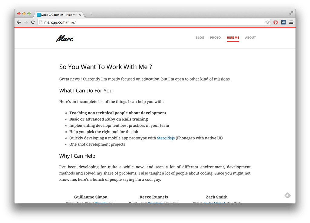
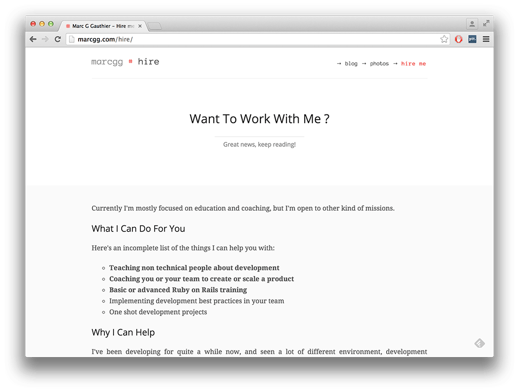
I’m not a good designer, not at all. However I still tried to create a new version of my website based on the old one - mainly because I grew really tired of the previous design.
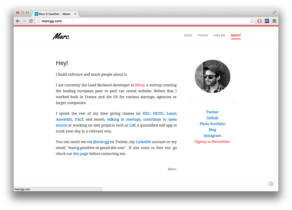
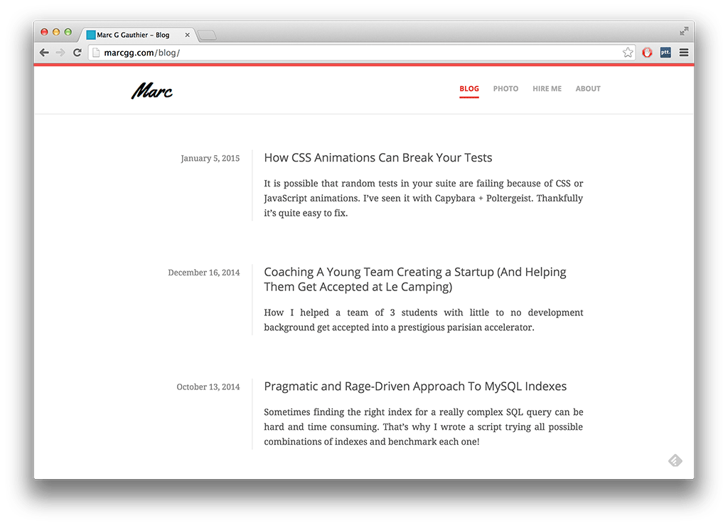
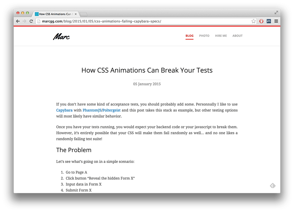
Here I tried to put the focus even more on the content without going full Richard Stallman. You’ll notice that there are less colors, but I added whitespace so that reading is a bit easier. I also gave up on having a logo since I just couldn’t figure out how to do that properly, so instead I added a title changing based on the category. Add to that some cleaning up of useless information, and voila!
I’ll leave this before/after gallery mainly for me to look at it later on, but if you have feedback on the changes, please let me know!
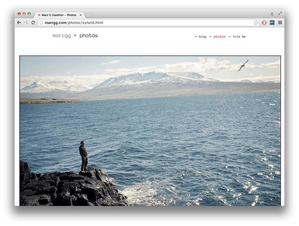
The old version is on the left, the new on on the right. Click any image to enlarge.
Homepage
Blog Index
Blog Post
Photos
On this one I removed the navigation on every page by an index page with a preview of each gallery that you can see here.
Hire Me Page
Mobile
The website looks decent on mobile, but I didn’t do a full responsive design. Maybe later!
Since you scrolled this far, you might be interested in some other things I wrote:
