A while ago I wrote about AppGyver’s SteroidsJS and its interesting take on hybrid app development. If you haven’t read it, basically they add the ability to use native UI elements in PhoneGap applications.
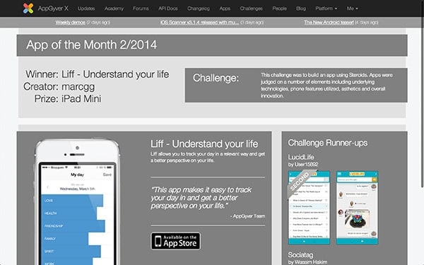
Since then I’ve teamed up with Kevin Tunc, worked a lot, managed to actually release something on the appstore and won AppGyver’s app of the month!

It wasn’t all that easy to create an hybrid app with a quality UI, so I figured I’d share some of the gotchas I ran into. I know it’s a longer article than what I use to post, but really this is what I wish was written when I started working on my app.
Of course, like any other things I write here, I don’t claim to know everything. Please take this as it is: some tips I learned making mistakes and wasting time. I’m no JavaScript guru master ninja 2.0 rock star, ain’t nobody got time for that! I’ll also focus on iOS because I built an iOS app, but a lot of this applies to Android phones as well. Also note that some parts of the article are just as true for any kind of hybrid app development, be it with PhoneGap or something else.
Getting The Device To Leave You Alone
You probably know all about using a reset.css file, but for a webview trying to pass for a native view, it’s not enough.
300ms Tap Delay
Mobile browsers implement a delay on tap to check if you tried to double tap or not. Overall it goes: touchstart -> touchend -> wait 300ms -> send click. This results in a terrible experience when navigating your app as it feels slow and/or broken.
For some browsers you can just specify a viewport and it’ll go away:
<meta name="viewport" content="width=device-width, user-scalable=no">If this solution doesn’t work, for instance if your code runs on Safari, use FastClick:
window.addEventListener('load', function() {
	FastClick.attach(document.body);
}, false);
Disable Selection/Copy When Long Tapping
You know… this thing:

Fixing this one is pretty easy. For webkit you add this in your CSS:
-webkit-user-select: none;
-webkit-touch-callout: none;
Disable Double Tap
If you don’t like double tapping and use jQuery, try this stackoverflow answer. Just in case this answer disapears, here’s what it looks like:
// jQuery no-double-tap-zoom plugin
// Triple-licensed: Public Domain, MIT and WTFPL license - share and enjoy!

(function($) {
  var IS_IOS = /iphone|ipad/i.test(navigator.userAgent);
  $.fn.nodoubletapzoom = function() {
	if (IS_IOS)
	  $(this).bind('touchstart', function preventZoom(e) {
	    var t2 = e.timeStamp
	      , t1 = $(this).data('lastTouch') || t2
	      , dt = t2 - t1
	      , fingers = e.originalEvent.touches.length;
	    $(this).data('lastTouch', t2);
	    if (!dt || dt > 500 || fingers > 1) return; // not double-tap

	    e.preventDefault(); // double tap - prevent the zoom
	    // also synthesize click events we just swallowed up
	    $(this).trigger('click').trigger('click');
	  });
  };
})(jQuery);
Disable Overscroll
I think that you want the “bounce” effect when you scroll out of a webview. It actually feels better for the end user. However in some specific cases you might need to disable this behavior. There are many ways of doing this and I personally used this one from stackoverflow:
function disallowOverscroll(){
  $(document).on('touchmove',function(e){
	e.preventDefault();
  });
  $('body').on('touchstart','.scrollable',function(e) {
	if (e.currentTarget.scrollTop === 0) {
	  e.currentTarget.scrollTop = 1;
	} else if (e.currentTarget.scrollHeight
	          === e.currentTarget.scrollTop
	              + e.currentTarget.offsetHeight) {
	  e.currentTarget.scrollTop -= 1;
	}
  });
  $('body').on('touchmove','.scrollable',function(e) {
	e.stopPropagation();
  });
}
Higcharts
If you use highcharts, you could run into some scrolling trouble when the user touches the graphs. This gist might help: https://gist.github.com/skarface/2994906
Allow Text Selection For Input
This is an iOS issue. In some cases you won’t be able to select and edit the text in your inputs as you’d like. You can fix this using user-select
-webkit-user-select: text;Better Looking Text
I noticed that changing the text-rendering option gets things to look better. The trade-off is performance, but if you don’t have huge chunks of text you’ll be fine.
text-rendering: optimizeLegibility;Remove Glossy Looking Buttons in Safari
How to go from a glossy stylized button (left) to a cleaner, flatter, easier to update button (right)?

Easy!
-webkit-appearance: carret;
-webkit-appearance: none; /* alernatively */
You can read more about this here. I also found that changing box sizing could help in the “undesign” process. Smarter people than me explained how it works, you can read about it or try it out like this:
-webkit-box-sizing: border-box;Removing Gray Highlight When Tapping Links
On mobile Safari, tapped links will get quickly highlighted, which doesn’t look very “native” once embeded in a Steroids JS webview. This is especialy true for images. Change this using:
-webkit-tap-highlight-color: #123456; /* To change it */
-webkit-tap-highlight-color: transparent; /* To remove it */
I found that changing the color feels better than removing it.
Overflow Scrolling
If you have some elements that are set to scroll when overflowing, you might feel that the scrolling itself doesn’t “feel right”. I suggest looking in this direction:
-webkit-overflow-scrolling: touch;On Fluid Layouts
Using percentages for size can be a good option to handle different screen sizes. Just know that there is a known issue where Safari rounds up percentages that can cause for weird behaviors when using fluid layouts.
Retina
If you build for iOS, you have to take retina into account. Spoiler: it’s a pain.
The Big Idea
Retina Display is a brand name used by Apple for liquid crystal displays that have a pixel density high enough that the human eye is unable to discern individual pixels at a typical viewing distance.
The short version of how to deal with it is pretty straightforward: create images twice as big, call them my_image@2x.jpg and resize them in CSS.
background: url(my_image.jpg);
background-size: 100px 100px; /* with my_image.jpg being 200x200 px */
Don’t Bother With Normal Size
If all your images are in your build and not on a remote server, I would recommend always loading the @2x version. The rule of thumb is that if it looks fine in retina, it will look fine in 1x and embeding the 1x image will only increase your build’s size and complexify the way you manage your assets.
Background Position
Be careful when using background positions with background sizes as they sometimes don’t play well together.
1px Border
If you specify a 1px border in your CSS, a 2px border will be displayed on retina displays. Yeah, this is pretty unituitive and a major pain. There are a lot of ways to try to get this to work.
This might not be best for you but, for my use case, I found Stephan Bönnemann’s solution simpler, and I ended adding a DOM element and styling it like this:
<div class="physical_1px"></div>.physical_1px{
background-image: linear-gradient(0deg, #DFDFDF, #DFDFDF 50%, transparent 50%);
background-size: 100% 1px;
background-repeat: no-repeat;
background-position: bottom;
height: 1px;
}This is not ideal, but I wasn’t a fan of the alternatives either. Check them out and make an opinion for yourself:
- Yes We Can Do Fraction Of A Pixel
- CSS, Retina, and Physical Pixels
- CSS: Emulate borders with inset box shadows
Performances
Avoid HTTP Calls
This seems obvious, but embed as many images and javascript libraries as possible in your build. It will run on mobile, and connectivity is an issue there. Yes it does increases build size, but it’s totally worth it.
jQuery ?
I used jQuery. There, I said it.
I knew it would degrade performances, but I benchmarked it a bit versus Vanilla JS and the difference was not really noticable for my use cases, so I kept it because I’m used to the syntax and it gets the job done.
Of course I followed the usual performances tips, not too much DOM manipulation, do not reselect the same element over and over etc.
CSS Performances
Animations
On a lot of devices CSS animations are slow. Often it’s not slow enough you want to stop using them altogether, but they are still not that good.
My point is that you should not count on perfectly smooth animations when designing your app.
Linear Gradients, QtWebkit and Graphics
During development I did run into major CSS performance issues. I’m not even kidding. This happened when I tried to apply an animation to a div with a linear-gradient.
Sometimes it’s tempting to use webkit’s drawing features, like -webkit-gradient, when it’s not actually necessary - maintaining images and dealing with Photoshop and drawing tools can be a hassle. However, using CSS for those tasks moves that hassle from the designer’s computer to the target’s CPU. Gradients, shadows, and other decorations in CSS should be used only when necessary (e.g. when the shape is dynamic based on the content) - otherwise, static images are always faster. On very low-end platforms, it’s even advised to use static images for some of the text if possible.
The solution here is to prefer using images as background images rather than CSS gradients. This is irritating, but I never found a way around this performance issue.
JavaScript
I’m not going to explain everything about JS performances. This could be a serie of articles in itself. It could even be a book. Actually, it is a book! Go check it out!
To sum it up: reuse objects, do not lock processes, be evented, large arrays will slow everything down.
Working with SteroidsJS
Alright, we talked a lot of general facts that could apply to any hybrid HTML 5 / CSS 3 app, but what about SteroidsJS itself?
Learning
Like any new libraries there will be problems, bugs and API changes. It is important to keep up to date, I’d suggest:
For documentation and tips on how to code:
- Use the API documentation which is quite extensive. Be aware that it is very poorly referenced on Google right now so you’ll have to be precise in your searches.
- Reading the tutorials is a must. They are well done and give a good overview of what the technology can do. There are also a lot of good step by step examples.
Organizing Code
I personally didn’t go the AngularJS route because it felt overkill for what I tried to achieve. I also didn’t like the MVC solution proposed by basic steroids scaffolding. In the end what worked for me was quite view-centric approach that looked like this:
- /app/views/my_scope/action.html (a view in a separate webview)
- /app/controllers/my_scope/action.js (all the JS related to a view)
- /app/models/data_persistence.js (everything that is transversal and relates to data)
- /www/javascripts/application.js (shared code between all views)
Overall once I set it up like this, it was easier to figure out what would interact with what.
Basic Customization & Features
Slider
If you’re in need of a touch slider, I recommend using Swipe.Js. It’s both simple, effective and very customizable.
window.mySwipe = Swipe(document.getElementById('slider'));The only gotcha is that you won’t be able to put inputs in a slide because text edition (long press on iOS) will not work properly.
Hammer.js
Hammer ships with Steroids JS, so I gave it a try. Overall it works fine for some events such as tap or release, but the way it handles clicks seemed buggy. I can’t quite put my finger on it, but in some cases I was better of just using jQuery for click events.
Use Clicks
When in doubt, use links and their click event. It will feel better for the end user than using tap or any other event. There is no need to get fancy.
Loader
I liked having a global way of calling a loader in any view and centralize the style and retry logic. The javascript code is pretty domain specific to my app, but I’ll share the CSS part if you want it to look like this:

<div id="loader" class="loader">
  <div id="text_load" class="loader_content" data-t="loading">...</div>
  <div id="retry_load" class="loader_content" data-t="retry"></div>
</div>
<div class="loader" id="loader_overlay"></div>
The loader overlay is to prevent any clicking to happened while the loader is present on the screen. The retry_load and text_load are the elements displayed when it succeeds or fails.
# loader{
  position: absolute;
  top: 130px;
  left: 70px;
  background-color: #000;
  z-index: 9999;
  width: 190px;
  font-size: 1.2em;
  opacity: 0.8;
  border-radius: 10px;
  color: #fff;
  text-align: center;
}
# retry_load{
  display: none;
}
.loader_content{
  display: block;
  padding: 70px 0px;
}

# loader_overlay{
  position: absolute;
  top: 0px;
  height: 620px;
  width: 320px;
  background-color: #000;
  opacity: 0;
  z-index: 500;
}
As you can see, the CSS is very simple. Again, not claiming to provide the definitive solution here, just some guidance. Feel free to improve on it and add a comment.
Settings
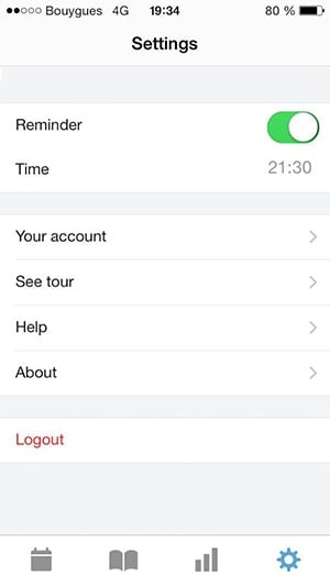
I think I managed to get a decent looking settings tab, but I didn’t find anything that would do it out of the box. Here’s a screenshot:

I’m not perfectly happy with the way I had to do it, so I won’t share it even if it does look fine. However you can take a look at what I used for the checkbox here. I found it in a comment on a very interesting article. Based on this I only had to change a couple of things (webkit-appearance, mostly) to get it to work perfectly within my app.
Local Storage
Here is a quick extract of my User model using the localStorage API for persistence.
window.User = {

  id: function(){
	return window.localStorage.getItem("liff_id")
  }

  setStatsMode: function(val){
	window.localStorage.setItem("liff_stats_mode", val)
  }

  // Way more things go here
}
If I were to complexify my data model, I would consider using SQLite.
Deeper Into SteroidsJS and Cordova
I18n
I decided to create my app in both French and English, so I had to deal with internationalization right away. I preferred handling it in the app rather than creating multiple builds or other complicated solutions. The performance problem was a non issue thanks to preloading (as explained further below).
Working with SteroidsJS means working with Cordova/PhoneGap. In this case the globalization API.
document.addEventListener("deviceready", function(){
  $(document).ready(function(){
	navigator.globalization.getPreferredLanguage(
	  function (language) {
	    localize(language.value)
	  },
	  function () {
	    localize("en")
	  }
	)
  })
})

function localize(language){
  $("body").attr("id", language)
  $("*[data-t]").each(function(){
	$(this).html(I18n[language][$this.data("t")])
  })
}
… meaning it will use my I18n object (very basic JSON) and replace the content of any HTML element with a data-t attribute. The body ID is set so I can load different images in CSS if needed.
I find it very easy to use every day and it’s decent performance wise if you don’t have too much text displayed.
Preloading
Preloading is great, it really speeds up everything.
As explained above, I internationalized my whole app. Because of this I’d have a couple of miliseconds blink before the text appears. Preloading views fixed this.
var someView = new steroids.views.WebView("/views/settings/some_view.html");
var anotherView = new steroids.views.WebView("/views/settings/another_view.html");

function preload(){
  someView.preload()
  anotherView.preload()
}
I also wait a bit before actually preloading the views, so the first app load time is reduced. I think it’s better to only preload when you really need it in order to preserve ressources.
setTimeout(preload, 3000)Learn more about it on AppGyver’s website.
Note that this not fully functional in production on my app because of an issue in Steroids JS where loading the navigation bar in a certain way disrupts preloading. Because of this you will see some minor blinking in some internal setting screens. It will be fixed soon :)
Getting Out Of The Background
You might want to do something when the user reopens the app after putting it in the background. Here’s how to do it:
document.addEventListener("resume", function(){
  // Do things
}, false);
Communicate Between Views
Using the postMessage API to communicate between views is the way to go.
/* In the first view */
window.postMessage({ type: "something_happened" }, "*")

/* In the second view */
window.addEventListener("message", function(msg) {
  if(msg.data.type == "something_happened"){
  }
})
Right now there is an open issue when adding alerts in the event listener as discussed [on the forum)[http://forums.appgyver.com/#!/steroids:sometimes-alerts-block-th).
Check Out The Result!
Of course you don’t have to take my word for it, give my application a try !
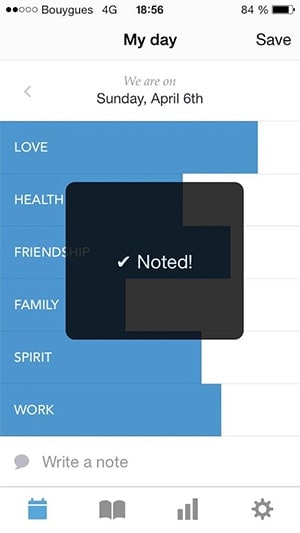
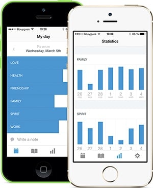
It’s called Liff and is available on the appstore. The goal is to give a relevant way to get insights on ones day and we put in extra efforts in order to create a pleasant experience with a solid design.

Clearly creating an hybrid app is easier than ever, but there is still a lot of things to keep in mind when doing so. Projects like PhoneGap push the ball in the right direction and I can’t wait to see what kind of apps we’ll be creating in a few years!
Since you scrolled this far, you might be interested in some other things I wrote: